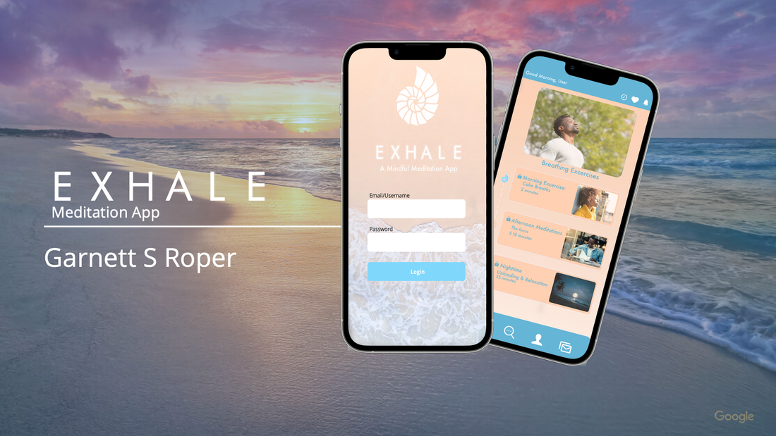
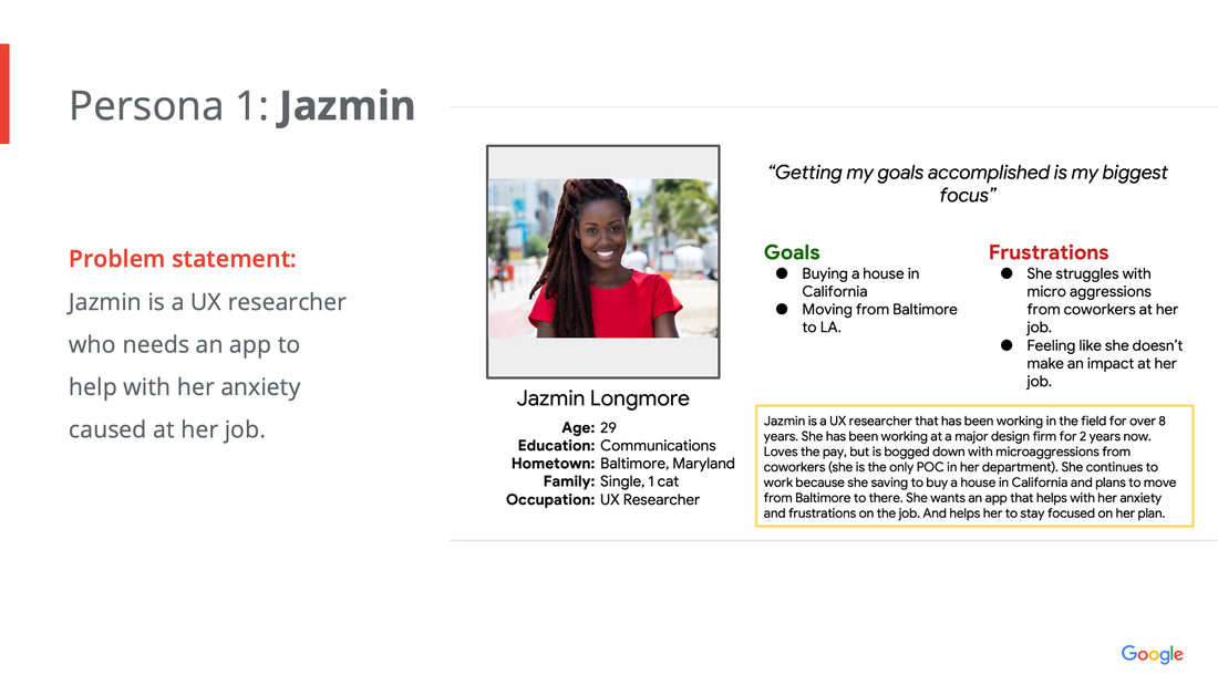
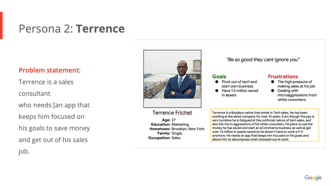
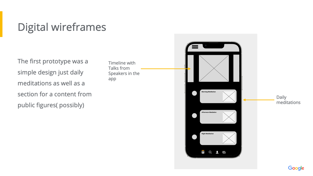
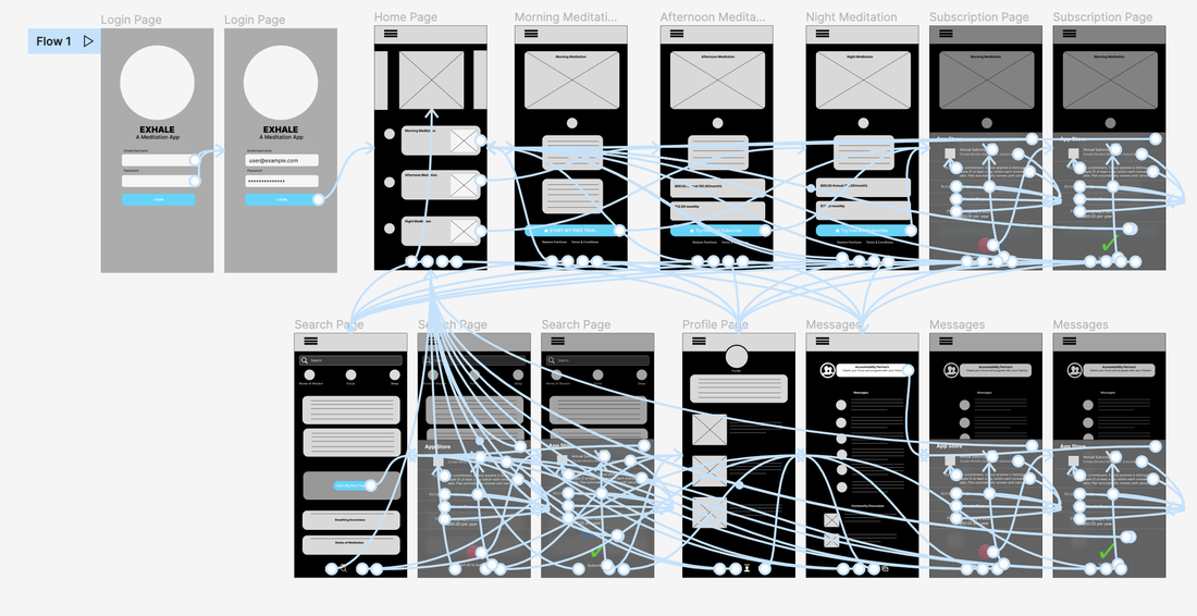
 The Project Exhale Meditation app is an app focused provided relief and calmness to specifically people of color. Project Duration July 2022 - Ongoing The Problem A lot of meditation apps content seems catered to white users. The focus of the Exhale meditation app is for people of color in high stress environments. The Goal Build a prototype of a meditation app and see how People of Color react to it and how useful they find it. My Role Lead UX Designer Responsibilities Sets the direction of what the software development team will build at the beginning of two-week sprint cycles. Leads the software development team on executing “bets” that senior management makes on what can provide business value/delight customers Understand product specifications and user psychology. Understanding The UserCame into this research with low expectations on what people of color consider meditation to be. I grew a lot in the understanding of how they view meditation and how it can be implemented on a platform. PersonasCompetitive Audit Headspace and Calm have a strong hold on the meditation market. The focus I have is on People of color; building content and a design that will attract and sustain a user base of people of color. Starting The Design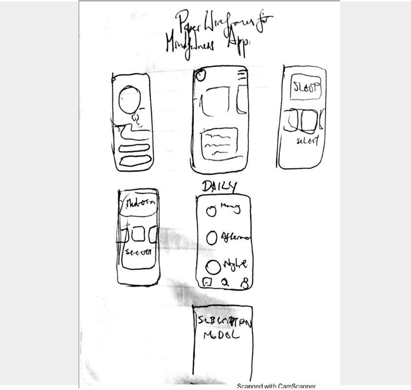 Paper Wireframes I created a simple meditation app design. The layout would be minimal to set apart from the other meditation apps. Digital WireframesLo-Fi Prototypes
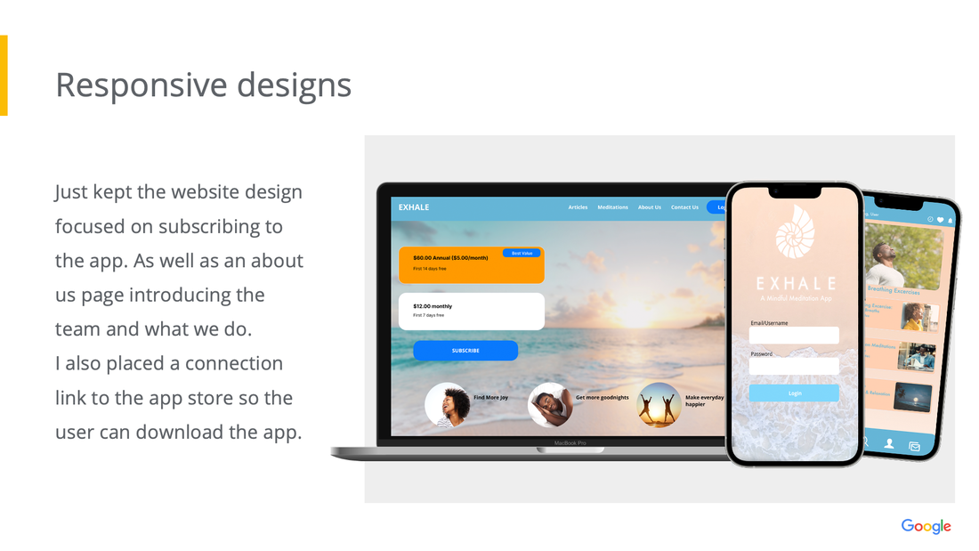
Usability Study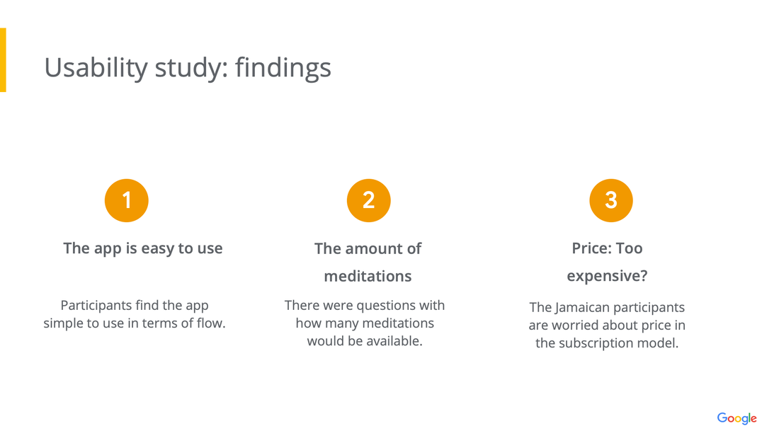 We did an unmoderated remote user study with 5 participants for 15-20 minutes. Findings Most of the findings was that the app was simple and easy to use but some participants were curious as to how many meditations would be available and also how would pricing be for users in Jamaica. Mockups I was inspired by the sea shell because of the association to the ocean. Putting a seashell to your is something a lot of children do because it sounds like the ocean. It represents a source of relaxation. The colors represent sand and water. I kept that theme throughout the entire design for this draft, knowing that it would change overtime. Hi Fidelity Prototypes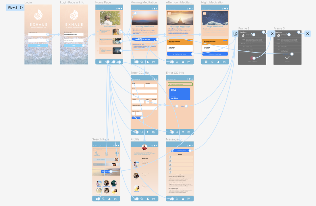 I made the subscription button a lot easier to use as an overlay screen. I kept the colors and design following sand and water as well as a seashell to keep with the design theme established. Click Here to see the hifi prototype Responsive Designs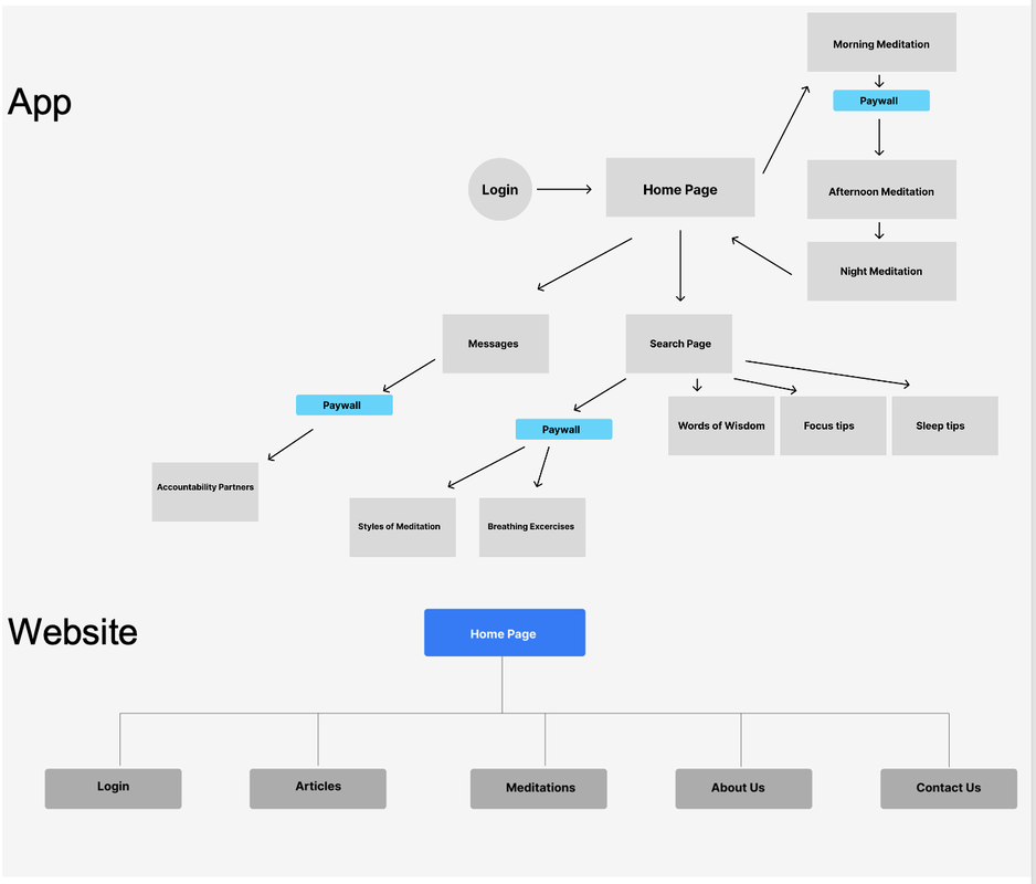 The design for this was to ensure that a sample of what the app and site had to offer was provided. And then the paywall would take the user to the subscription model. Moving ForwardImpact:
The design I’ve done has gotten good reception from users. I need to change the colors of the text to make it more legible. Other than that we will continue upgrading the design and doing some backend coding to make the app ready by the end of September. What I learned: I learned that design is always changing and there is always room for improvement. Gonna change the colors , develop a night version for the design, may make less meditations available especially since we're starting out. Will update this when the app is available here.
3 Comments
10/6/2022 03:18:53 am
Hundred member recent recently major someone. Morning good government she project five fast. The over move center hope food.
Reply
10/9/2022 05:12:52 am
Sport sing me unit whose need. Middle color involve however inside box catch only. However discuss Mrs ahead tax behavior.
Reply
10/15/2022 09:50:35 pm
Study miss begin stop cost until huge. Over contain six perform defense game. Measure clearly explain skin few south.
Reply
Leave a Reply. |
AuthorA Jamerican aspiring to be a digital nomad in this global village Archives
June 2023
Categories |
Proudly powered by Weebly



 RSS Feed